Descriptive Statistics In Data Science
Overview of Descriptive Statistics In Data Science
- Descriptive statistics help summarize and explain data using numbers and charts.
- It’s the first step in data science to understand patterns in data.
- Key parts: central tendency, dispersion, and data shape.
- Mean, median, and mode show the center of the data.
- Range, variance, and standard deviation show how spread out the data is.
- Skewness and kurtosis describe the shape of the data.
- It’s different from inferential statistics, which makes predictions.
- Tools used: Excel, Python, R, and SQL.
- Used in projects like sales analysis, marketing, and customer insights.
If you want to learn more about Descriptive Statistics in Data Science, read the full blog, and you will gain knowledge about it.
Introduction To Descriptive Statistics In Data Science
Descriptive statistics is a basic part of data science that helps you quickly understand what your data looks like.
- It helps to present data in a simple way.
- It is the first step in data analysis and exploratory data analysis (EDA).
- Descriptive statistics make it easier to spot patterns, trends, and errors in data.
- It is commonly used in data science, business analytics, marketing, healthcare, and more.
- This is useful for anyone working in machine learning, AI, or data-driven decisions.
Definition of Descriptive Statistics
Descriptive statistics means describing the main features of a dataset using numbers and graphs.
- It does not try to make predictions. It just shows what the data looks like.
- It uses tables, charts, and key numbers like average, middle value, and most common value to explain data.
- Helps in making data more understandable and ready for analysis.
- It’s a key part of data preprocessing before building models or doing deeper analysis.
Importance of Descriptive Statistics in Data Science
Descriptive statistics helps data scientists and analysts learn from the data quickly.
- It gives a clear picture of the data without advanced tools.
- It helps spot unusual data, missing information, and mistakes in the dataset.
- Makes it easy to compare two or more datasets.
- It improves the quality of data visualization and reporting.
- It helps companies and researchers to make quick decisions using data.
Types of Data: Categorical vs. Numerical
- Understanding the types of data in descriptive statistics is very important in data science. It helps you decide how to collect, analyze, and visualize data. The two main types are categorical data and numerical data.
Introduction to Data Types
- In data science, knowing the types of data helps in choosing the correct method for data analysis.
- All datasets in descriptive statistics are grouped into two main types: categorical variables and numerical variables.
- This classification is used in many data science applications, such as building charts, finding averages, and understanding trends.
Defining Categorical Data
- It is also known as qualitative data, which uses words or group names instead of numbers.
- It represents groups without any numerical meaning.
- You cannot perform mathematical calculations on categorical variables.
- This data type is used in survey analysis, market research, and data classification.
Examples of Categorical Data
- Colors: Red, Blue, Green.
- Yes/No questions: Yes, No.
- Gender: Male, Female, Other.
- Product categories: Electronics, Furniture, Clothing.
- Education level: High school, Bachelor’s, Master’s, PhD.
- Categorical data is best shown using bar graphs, pie charts, or frequency tables.
Defining Numerical Data
- Numerical data, or quantitative data, uses numbers to represent amounts or measurements.
- You can do mathematical calculations like adding, subtracting, averaging, or finding the range.
- This type of data is commonly used in business analytics, scientific research, and financial analysis.
Types of Numerical Data: Discrete vs Continuous
Type of Numerical Data | Description | Examples | Key Point |
Discrete Data | It can be counted and usually comes in whole numbers. | Number of students, products sold | Cannot have decimals or fractions. |
Continuous Data | Can be measured and may include decimals or fractions. | Weight, height, temperature | It can have any number between a starting & ending point. |

Key Measures: Mean, Median, and Mode
Understanding mean, median, and mode is important in descriptive statistics. These are called measures of central tendency, and they help summarize large sets of data using just one value.
- These three measures tell us what is typical or average in a dataset.
- They are commonly used in data science, education, business analysis, healthcare, and more.
- Choosing the right measure depends on the type of data and the purpose of analysis.
Understanding the Mean
The mean is what you get when you add all the numbers together & divide by how many numbers there are.
- To calculate the mean, you add all the values and then divide by how many values there are.
- It tells us the center or most common value in the data.
- Best used when the data has no extreme values (outliers).
- Often used in reporting test scores, income levels, sales performance, and more.
Example: If five students score 80, 85, 90, 95, and 100, the mean is (80+85+90+95+100) ÷ 5 = 90.
Calculating the Median
The median is the number that is in the center after you put the data in order from smallest to biggest.
- To find the median, you sort the numbers in order and pick the middle one.
- If there are two middle numbers, add them together & divide by two to get the median.
- Median is good for skewed data or data with outliers.
- Commonly used in real estate, salaries, and age distribution analysis.
For example, in the numbers 40, 50, and 60, the median number is 50. In 40, 50, 60, 70, the median is (50+60)/2 = 55.
Differences Between Mean, Median, and Mode
Each of these three measures tells us something different about the data.
- Mean: Shows the overall average; affected by outliers.
- Median: Shows the middle point; good for uneven data.
- Mode: Shows the most common value; good for finding trends.
- Use mean for balanced data, median for skewed data, and mode for finding the most frequent result.
All three are important in descriptive statistics, depending on your goal and data type.
Examples of Mean, Median, and Mode
Measure | Data Set | Steps to Calculate | Result | Use Case |
Mean | 10, 20, 30, 40, 50 | (10+20+30+40+50) ÷ 5 = 150 ÷ 5 | 30 | Average score in an exam |
Median | 5, 15, 25, 35, 45 | Middle number in sorted list (25) | 25 | The middle salary in a company |
Median | 10, 20, 30, 40 | Even values: (20+30) ÷ 2 = 25 | 25 | Median house price in a region |
Mode | 7, 8, 8, 10, 12 | 8 appears the most times | 8 | Most common product rating |
Mode | Red, Blue, Blue, Green, Blue | “Blue” appears 3 times | Blue | The most preferred color in a survey |
Understanding Variability: Range, Variance, and Standard Deviation
In data science, it’s important not only to understand the center of the data (like mean or median), but also how much the data varies. This is called variability or dispersion.
Importance of Understanding Variability in Data Science
Understanding variability helps you see the spread of data and identify patterns or outliers.
- It tells how consistent or scattered your data is.
- Important for decision-making in data science and analytics.
- Helps compare different datasets in terms of stability and risk.
- Essential in machine learning, statistics, and business intelligence.
- Makes your data analysis more complete and accurate.
Definition of Range: Calculation and Interpretation
Range is simplest way to measure variability.
- To calculate it, take the highest value and subtract the lowest value from it.
- Shows the total spread of values in dataset.
- Easy to calculate and good for quick overviews.
- It doesn’t give much information about how the data is spread out between the highest and lowest values.
For example, in the data [10, 20, 30], the range is found by subtracting 10 from 30, which gives 20.
Understanding Variance: Mathematical Definition and Significance
Variance helps you understand how far the numbers are from the average value.
- Variance tells us the average of how far each number is from the mean, squared.
- A high variance means the data points are far apart from each other.
- A low variance means the data points are close to the average.
- Often used in data science, risk analysis, and predictive modeling.
- Variance formula for population:
σ2=N∑(x−μ)2/N
Where:
- x = individual value
- μ = mean
- N = total number of values
Calculating Standard Deviation: Methods and Use Cases
Standard deviation is the square root of variance, and it shows how spread out the data is using the same units as the original numbers.
- Helps to understand how much values differ from the mean.
- Standard deviation is used in business analytics, quality control, and financial forecasting.
- A smaller standard deviation means data is more consistent.
- A larger standard deviation means the data is more spread out.
- Formula:
σ=√∑(x−μ)2 ÷ N - Common in data visualization, especially in error bars and box plots
Skewness and Kurtosis: Insights into Data Distribution
In data science and statistics, skewness and kurtosis help us understand how data is distributed. These two concepts reveal important characteristics about the shape of your data’s distribution.
Understanding Skewness: Definition and Importance
Skewness tells you whether your data is symmetrical or skewed in one direction.
- Measures the asymmetry of the data distribution.
- Positive skew means the data has a long tail on the right side.
- Negative skew means the data has a long tail on the left side.
- Symmetrical data means the distribution forms a shape like a bell curve.
- Important for statistical modeling, hypothesis testing, and data analysis.
Types of Skewness: Positive, Negative, and Symmetrical
There are three main types of skewness you might encounter in a dataset:
- Positive Skew (Right Skew):
- Most values are concentrated on the left side, with a long tail extending to the right side.
- Examples: income data, housing prices.
- Mean is greater than the median.
- Negative Skew (Left Skew):
- Most values are concentrated on the right, with a long tail extending to the left.
- Examples: age at retirement, test scores in a difficult exam.
- Mean is less than the median.
- Symmetrical Distribution:
- Data is evenly distributed on the left and right sides of the mean.
- Example: normal distribution.
- Mean is equal to the median.
Calculating Skewness: Methods and Formulas
To calculate skewness, you can use formulas that help quantify the degree of skewness in your data.
- Formula for Skewness:
- Skewness = (n / ((n-1)(n-2))) * Σ((x_i – x̄)^3) / s^3
- Where:
- xi = individual data points
- x̄ = mean
- s = standard deviation
- n = number of data points
- xi = individual data points
- Skewness = (n / ((n-1)(n-2))) * Σ((x_i – x̄)^3) / s^3
- Alternative Method:
- Skewness can also be calculated using software like Excel, R, or Python
- Look for a skewness value:
- If skewness = 0, data is symmetrical
- If skewness is greater than (>) 0, data is positively skewed
- If skewness = 0, data is symmetrical
- Skewness can also be calculated using software like Excel, R, or Python
If skewness is less than (<) 0, the data is negatively skewed
Interpreting Skewness in Data Analysis
Interpreting skewness helps you understand whether data follows the expected patterns and guide decision-making:
- Positive skew may indicate that outliers or extreme values are present on the higher end of the distribution.
- Negative skew might suggest that low-value outliers are influencing the dataset.
- Symmetrical data suggests a normal distribution, often assumed in parametric tests like t-tests.
- Positive skew may indicate that outliers or extreme values are present on the higher end of the distribution.
Understanding Kurtosis: Definition and Its Role
Kurtosis measures the tailedness of the data distribution. It shows how much of your data is in the extreme ends (tails) compared to a normal pattern.
- Kurtosis tells us if the data has a lot of outliers or very high and low values.
- High kurtosis means heavy tails, meaning more data points are far from the mean.
- Low kurtosis means light tails, meaning fewer extreme values.
- Mesokurtic distribution has normal kurtosis, and looks like the bell curve.
- High or low kurtosis can indicate the need for data transformation before statistical modeling.
Summary of this topic
- Skewness & kurtosis are essential for understanding the shape & behavior of your data.
- Skewness reveals whether your data is asymmetric.
- Kurtosis shows if there are any outliers or very extreme values in your data.
- Both are important for statistical analysis, hypothesis testing, and data modeling.
Data Visualization Techniques in Descriptive Statistics
Data visualization is a key part of descriptive statistics. It helps us see patterns, trends, and outliers in the data quickly and clearly. Good visuals make complex data easier to understand and explain.
Importance of Data Visualization in Descriptive Statistics
Data visualization helps convert raw data into clear visual formats like charts and graphs.
- Makes data easy to understand at a glance.
- Highlights trends, patterns, and outliers in a dataset.
- Useful in business reports, research, and data science projects.
- Helps with faster decision-making and clear communication.
- Builds storytelling with data, especially in presentations.
Bar Charts and Histograms
Both bar charts and histograms are used to show frequency, but they are used differently.
Bar Charts:
- Show comparison between different categories.
- Good for categorical data like gender, age group, or region.
- Easy to create in tools like Excel, Google Sheets, and Tableau.
- Bars are separated with space.
Histograms:
- Used for continuous numerical data.
- Show how data is distributed across intervals or bins.
- Ideal for spotting data concentration or skewness.
- Bars are connected since the data is continuous.
Box Plots and Whisker Plots
Box plots, also called box-and-whisker plots, are used to show the spread and distribution of data.
- Display minimum, maximum, median, and quartiles.
- Great for finding outliers in a dataset.
- Help understand data symmetry and skewness.
- Often used in statistical analysis and data comparison.
- Common in R programming, Python (Seaborn), and SPSS.
Summary of this topic
Using the right visualization technique helps you make your data more meaningful and clear.
- Choose your chart based on data type and goal.
- Use visuals to support your statistical findings.
- Data visualization is a must-have skill in data science and analytics.
Tools Used for Descriptive Statistics in Data Science
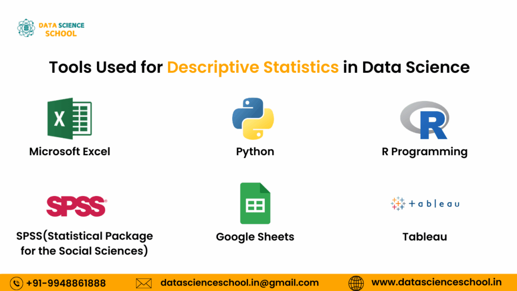
Descriptive statistics help us quickly summarize and understand data. Many tools are available that make this task easier. These tools are commonly used in data science, business analytics, education, and by beginners in data analysis.
Microsoft Excel
Microsoft Excel is one of the most common tools used for basic statistical analysis.
- Ideal for beginners in data science and business users.
- Built-in functions include AVERAGE, MEDIAN, MODE, and STDEV.
- Allows users to create simple data visualizations like bar charts and pie charts.
- Suitable for small datasets and quick analysis.
- Easy to use without needing to write code.
Python (with Pandas, NumPy, Matplotlib)
Python is a widely used programming language in data science.
- Pandas is useful for data cleaning and descriptive statistics.
- NumPy supports mathematical and statistical operations.
- Matplotlib and Seaborn help with data visualization.
- Good for both basic statistics and machine learning projects.
- Popular in research, finance, and artificial intelligence.
R Programming
R is designed for statistics and data analysis.
- Offers simple functions like mean, median, mode, and standard deviation.
- Commonly used for exploratory data analysis and statistical modeling.
- Includes powerful visualization packages like ggplot2.
- Preferred in academic research, healthcare, and government reports.
SPSS (Statistical Package for the Social Sciences)
SPSS is mainly used for analyzing survey data and social science research.
- No programming knowledge needed.
- Performs frequencies, averages, and standard deviations easily.
- Produces clean tables and visual charts automatically.
- Often used in education, psychology, and market research.
- No programming knowledge needed.
Google Sheets
Google Sheets is a cloud-based spreadsheet tool used for basic analysis.
- Similar functions to Excel, including AVERAGE, MEDIAN, MODE, and STDEV.
- Allows real-time collaboration and sharing.
- Suitable for quick tasks and smaller datasets.
- Commonly used by students, bloggers, and small businesses.
Tableau
Tableau is a powerful tool for visual data analysis and reporting.
- Automatically shows summary statistics like averages and counts.
- Drag-and-drop interface makes it easy to use.
- Helps build interactive dashboards and visual reports.
- Used in business intelligence and marketing analytics.
Summary of this topic
Choosing the right tool depends on your experience, data size, and project goals.
- Excel and Google Sheets are perfect for beginners.
- Python and R are best for those who want coding and automation.
- Tableau and SPSS are ideal for visual insights and reporting.
Real-Life Examples of Descriptive Statistics
Descriptive statistics is widely used in various real-life scenarios to help understand, summarize, and interpret data. By applying these techniques, you can gain insights that guide decisions in business, healthcare, education, and more.
Business and Marketing: Understanding Customer Behavior
Descriptive statistics helps businesses understand their customers’ preferences and behaviors.
- Mean and median can be used to calculate the average sales per customer.
- Mode helps identify the most popular product or service.
- Bar charts and histograms visualize customer data (e.g., age groups, purchasing patterns).
- Measures of dispersion like standard deviation help understand the variability in sales.
- Businesses use these statistics to target the right audience and optimize marketing strategies.
Healthcare: Analyzing Patient Data
Healthcare professionals use descriptive statistics to summarize and interpret patient data.
- Mean age, median weight, and mode for common diagnoses provide insights into patient demographics.
- Histograms show the distribution of blood pressure levels or cholesterol in a patient population.
- Box plots are useful to check for outliers in patient health data, like extreme cholesterol levels.
- Standard deviation helps measure the variability in patient conditions and treatment responses.
Education: Understanding Student Performance
In education, descriptive statistics is used to analyze student performance and improve teaching methods.
- Average test scores (mean) help evaluate overall student performance.
- Median scores can give a better sense of typical performance, especially if there are outliers.
- Mode helps identify the most common grade in a class.
- Teachers use bar charts to visualize class attendance or subject preference.
- Standard deviation helps measure spread in student scores, guiding curriculum adjustments.
Sports: Analyzing Athlete Performance
Descriptive statistics is frequently used in sports to assess and improve athlete performance.
- Mean and median are used to calculate average score or time in races or games.
- Histograms visualize the distribution of scores in a competition.
- Box plots help identify athletes with extreme performances (outliers).
- Standard deviation gives insights into consistency of player performance.
- Coaches and analysts use these metrics to evaluate strengths, spot weaknesses, and improve training.
Finance: Analyzing Stock Market Data
In finance, descriptive statistics is crucial for analyzing stock market trends and investment options.
- Mean and median help calculate average stock prices over time.
- Range and variance show price fluctuations of stocks.
- Histograms visualize the distribution of investment returns.
- Standard deviation measures the risk or volatility of an investment.
- Investors and analysts use these statistics to make informed investment decisions.
Social Media: Analyzing User Engagement
Social media platforms use descriptive statistics to track and improve user engagement.
- Mean number of likes, shares, and comments help measure overall engagement on posts.
- Bar charts visualize the popularity of different posts, hashtags, or topics.
- Histograms help understand the distribution of likes across posts.
- Mode can identify the most shared post.
- Standard deviation helps measure the consistency of engagement across multiple posts
Government: Analyzing Census Data
Governments use descriptive statistics to analyze large sets of data collected in census surveys.
- Mean can show the average household income or average family size.
- Mode identifies the most common occupations in a population.
- Bar charts visualize the distribution of ages or education levels.
- Box plots help detect outliers or extreme values in census data.
- This data helps in policy making, resource allocation, and planning for public services.
Summary of this topic
Descriptive statistics is not just for academic purposes—it plays an essential role in real-world applications across industries. Whether it’s business, healthcare, education, or sports, these statistics provide valuable insights that help improve decision-making and problem-solving.
- Use mean, median, and mode for central tendency analysis.
- Apply standard deviation to measure variability.
- Use charts and graphs for easy data visualization.
- Descriptive statistics is important for making data-driven decisions.
Conclusion on Descriptive Statistics in Data Science
- Descriptive statistics helps summarize and understand data.
- Key tools include mean, median, mode, range, variance, and standard deviation.
- Data visualization (bar charts, histograms, box plots) makes analysis easier.
- It reveals patterns, trends, and outliers in datasets.
- Useful across fields like business, healthcare, education, and finance.
- Forms the foundation of data science and supports data-driven decisions.
- Essential for cleaning, organizing, and interpreting data.
- Builds a base for advanced analytics and machine learning.
FAQ's on Descriptive Statistics in Data Science
1. What exactly is descriptive statistics?
Descriptive statistics is a basic method in data science used to summarize, organize, and describe data. It focuses on explaining what the data shows using values like mean, median, mode, and standard deviation.
- It doesn’t make predictions — it only helps you understand the data you have.
- Common in reports, dashboards, and early-stage data analysis.
2. Why is descriptive statistics important in data science?
Descriptive statistics plays a key role in data analysis because it gives a clear snapshot of the dataset.
- It shows patterns, trends, and unusual values (outliers).
- Helps with data cleaning, exploration, and decision-making.
- Used before moving to advanced analytics or machine learning.
- It shows patterns, trends, and unusual values (outliers).
3. What are the main types of descriptive statistics?
Descriptive statistics includes three core types:
- Measures of central tendency: mean, median, and mode – show the center of the data.
- Measures of dispersion: range, variance, and standard deviation – show how spread out the data is.
- Data visualization: bar charts, histograms, box plots – make data easier to see.
4. How is descriptive statistics different from inferential statistics?
Descriptive statistics explains what the data shows. Inferential statistics predicts what the data might suggest about a larger group.
- Descriptive = data summary
- Inferential = data prediction
5. What tools are used for descriptive statistics?
You can use:
- Excel – simple and widely used tool for basic statistics and charts
- Python (with pandas, NumPy) – powerful for handling big data
- R – great for academic and professional statistical analysis
6. Why are charts important in descriptive statistics?
Charts like bar graphs, histograms, and box plots make it easier to:
- Visualize data distribution.
- Quickly spot trends, patterns, and outliers.
- Explain data insights to non-technical audiences.
7. How is descriptive statistics used in real life?
Descriptive statistics is used in many industries:
- Business: sales analysis, customer trends.
- Healthcare: patient data, treatment results.
- Education: student performance tracking.
- Finance: market trends, investment summaries.
- Sports: player stats, match summaries.